Clever name eh?
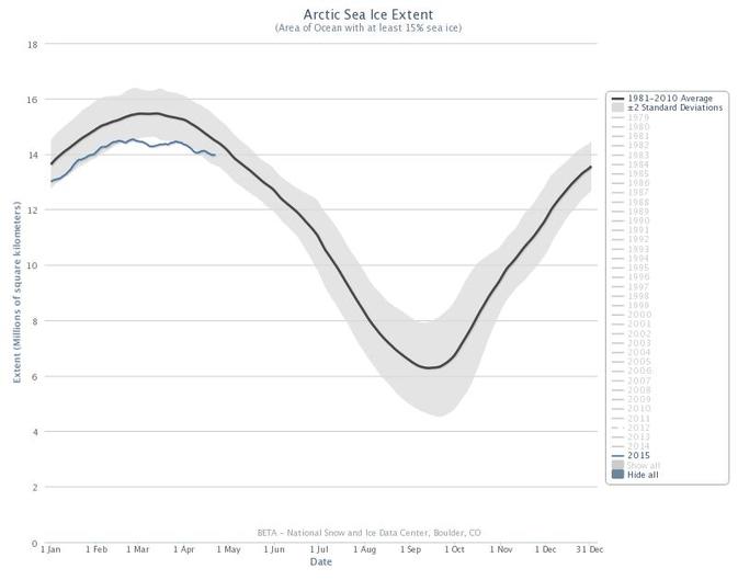
My best friend from high school knows a lot about data and tracking environmental happenings around the world. She thought we would like this Charctic Interactive Sea Ice Graph from the National Snow and Ice Data Center. The graph below will take you to the interactive one where you can compare the amount of sea ice from 1975-2015.
What do you notice?
There is a lot of interesting information on the NSIDC site for you to explore. About the Cryosphere is a great place to start.
 RSS Feed
